The Wall Street Journal Redesign

The Wall Street Journal redesign, domestic edition. Published by Dow Jones. Some of our goals, in redesigning The Wall Street Journal, were to make the newspaper more accessible, easier to navigate, faster to get through (well paced, with a carefully constructed typographic hierarchy and various new navigation devices), and easier to carry (it's now one column narrower in width).
James Reyman, hired by WSJ DD, Joe Dizney, was a member of the core redesign team, working in collaboration with two other Art Directors, David Pybas of The Wall Street Journal and Mario Garcia of Garcia Media. We worked closely alongside Marcus Brauchli, Managing Editor of the Journal and Jim Pensiero, Senior VP of special projects.
New text and display faces by the Hoefler Frere-Jones foundry were key elements of the redesign along with newly redesigned charts and graphs created by the graphic team at the Journal.

The Wall Street Journal redesign. Published by Dow Jones.

The Wall Street Journal redesign. Published by Dow Jones. Cover of the Reader's Guide, launch edition.
The Wall Street Journal redesign. Published by Dow Jones.

The Wall Street Journal redesign. Published by Dow Jones.
The Wall Street Journal redesign, Asia Edition. Published by Dow Jones.
The Wall Street Journal redesign, Europe Edition. Published by Dow Jones.

The Wall Street Journal redesign, Asia Edition. Published by Dow Jones.

The Wall Street Journal redesign, Asia Edition. Published by Dow Jones. Illustration by Steven Salerno
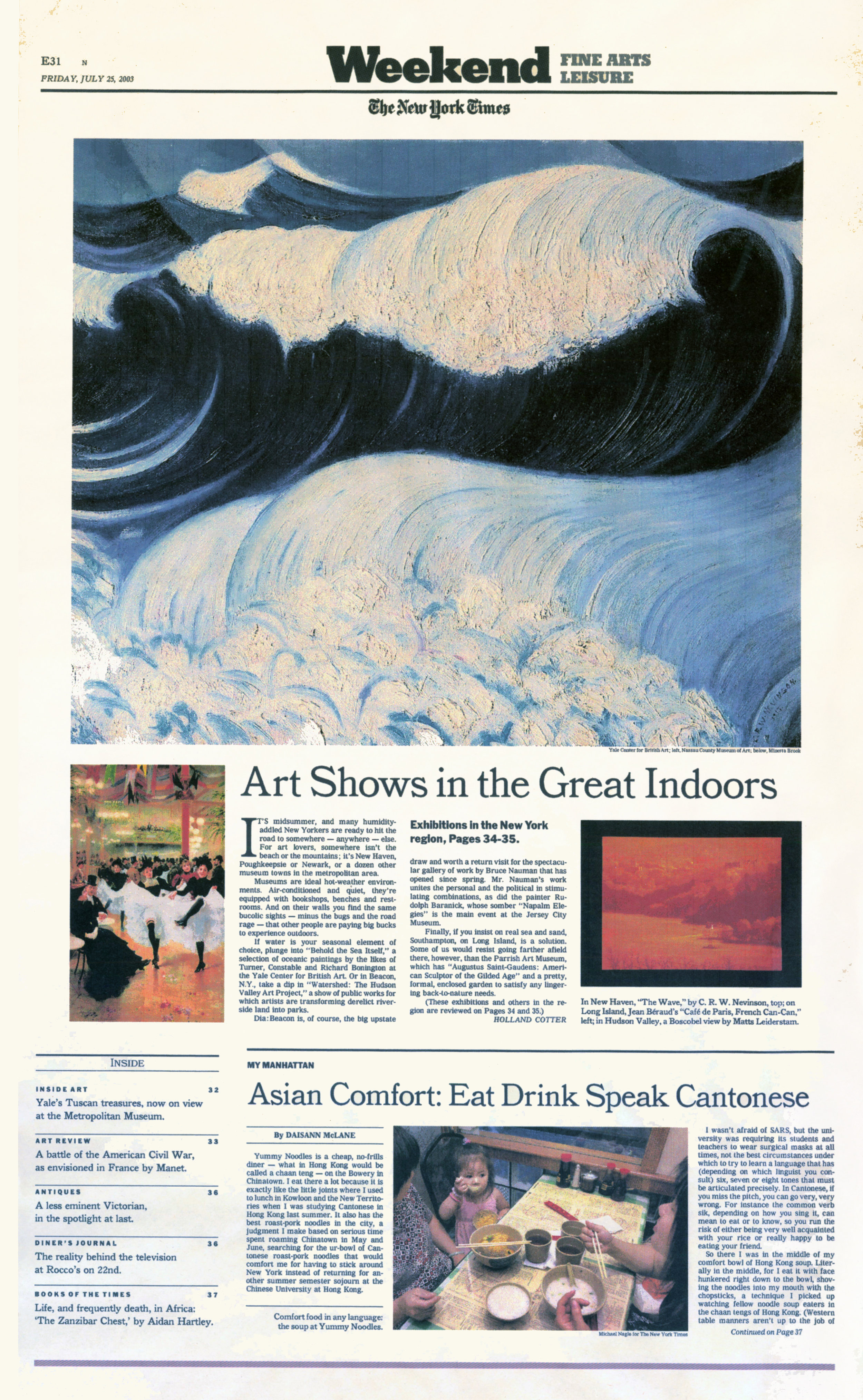
The New York Times Weekend Section

The New York Times weekend section. James Reyman has been a guest Art Director for the Weekend section of The New York Times.
The New York Times weekend section.

The New York Times weekend section. Illustration by Ward Schumaker
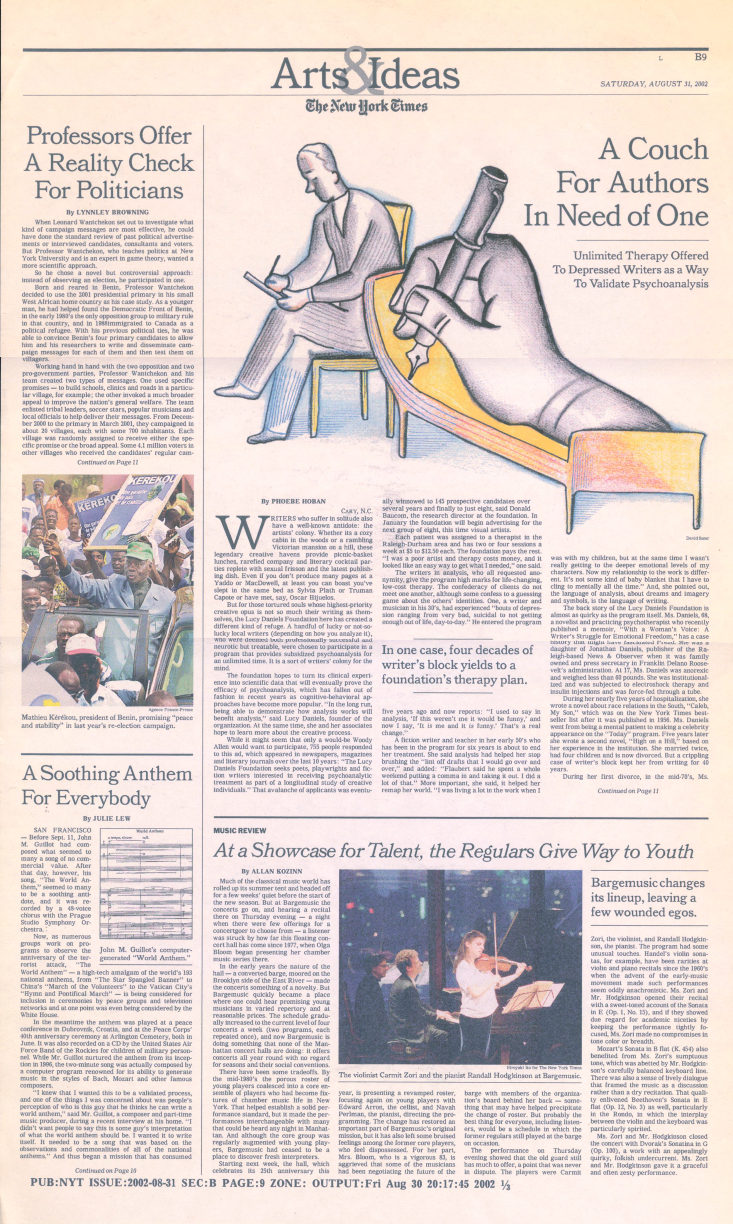
The New York Times weekend section. Illustration by David Suter

The New York Times weekend section.

The New York Times weekend section. Illustration by Tom Bachtell
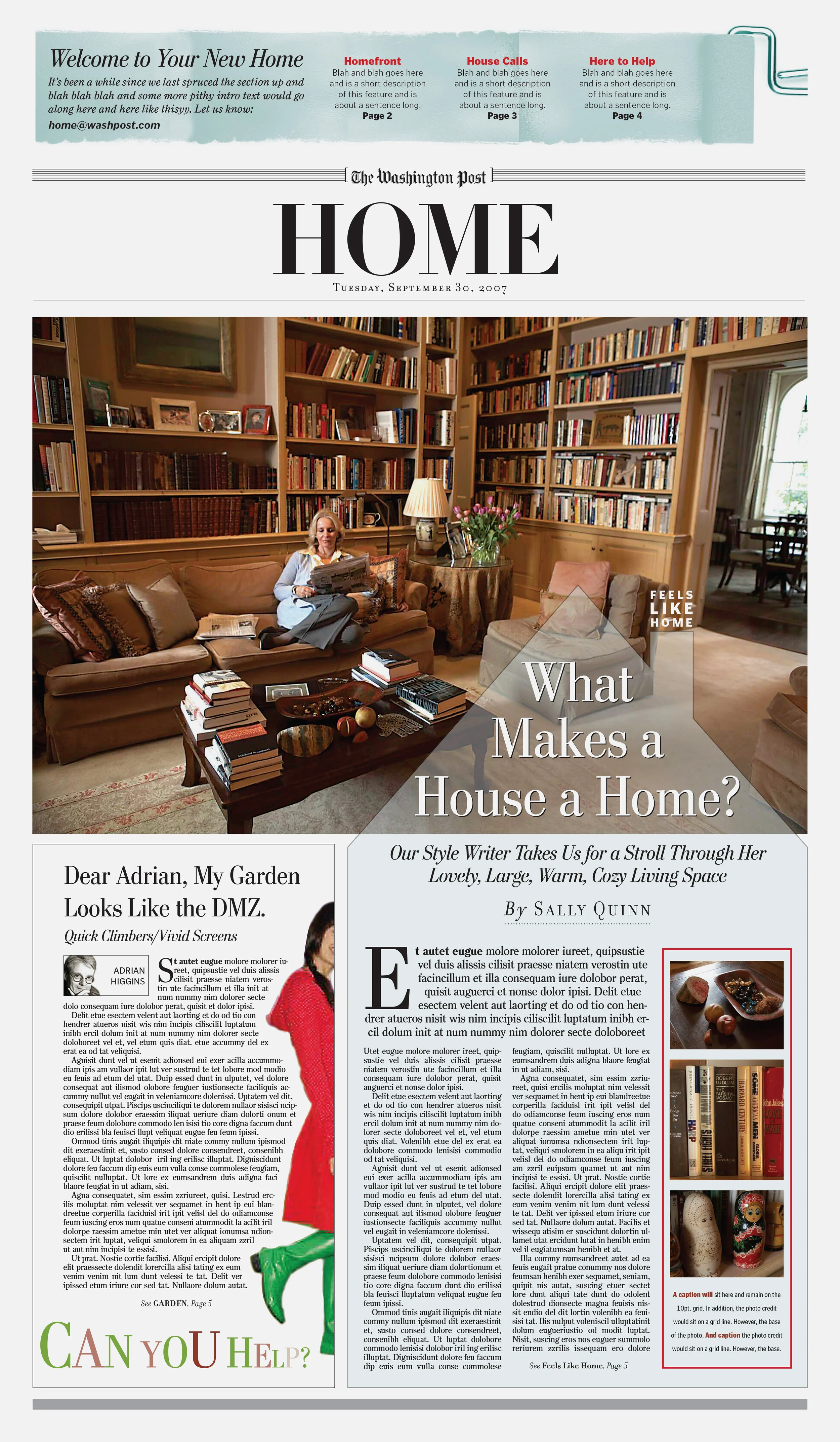
The Washington Post Home Section Redesign
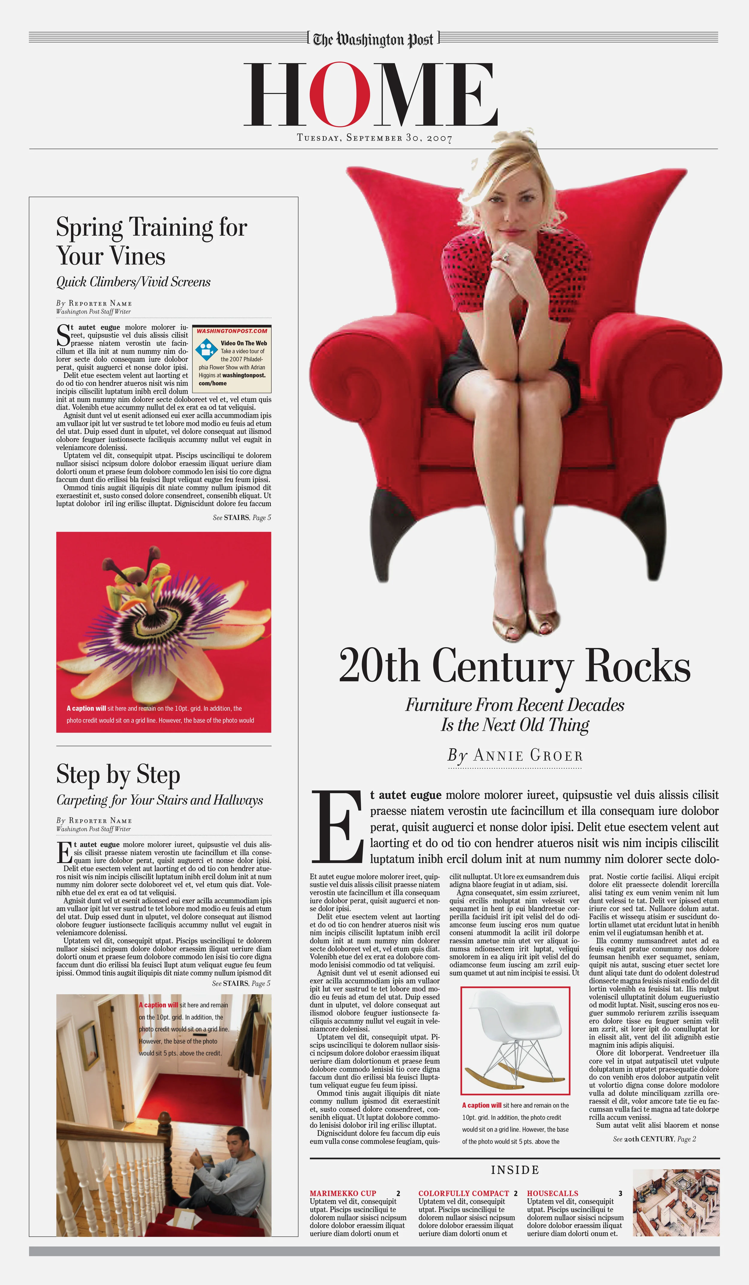
The Washington Post hired us to redesign their Home Section. An intensive, 'boot camp' with James and the editors and art directors of the newspaper helped the team to rethink the section. Ideas were approved then implemented by Art Directors of the Post.

The Washington Post Home Section Redesign

The Washington Post Home Section Redesign
The Washington Post Home Section Redesign
To Kill A Mockingbird - Prop Design for Broadway Play
I received a call at my studio from the great illustrator and prop master, Ross McDonald, with a fascinating project. Could I design a newspaper that will be used on stage in the new Broadway production of, To Kill a Mockingbird, starring Jeff Daniels? Of course I said yes, but asked, Doesn't that start up in previews like, next week? Yes, it does!! So I started up researching newspaper headlines from small town Alabama cities in 1935 and found an amazing amount of information. The director gave us a newspaper title (The Mobile Press, which Atticus actually reads in the book) and I designed it; cover and interior pages, in 2 days. Ross had them printed at a newspaper up in Connecticut today, and Voila! I used the old, 8-column grid that was popular back then and rules between every column. The photos are from Alabama newspapers in 1935. And it's a broadsheet!
The Mobile Press. Newspaper Design used as a prop in the new Broadway production of, To Kill A Mockingbird.
The Mobile Press. Newspaper Design used as a prop in the new Broadway production of, To Kill A Mockingbird.
The Mobile Press. Newspaper Design used as a prop in the new Broadway production of, To Kill A Mockingbird.
Jeff Daniels holds the newspaper I designed for the new Broadway production of, To Kill a Mockingbird. The New York Times reviewed it very favorably even though they did not even mention the great props!! Ross MacDonald designed all the other props in the play.
Celia Keenan-Bolger, left, as Scout and Jeff Daniels as her father, Atticus Finch, in Aaron Sorkin’s adaptation of “To Kill a Mockingbird.” Photo: Sara Krulwich/The New York Times
King Lear - Prop Design For Broadway Play
So I received another call from my friend, Ross MacDonald. Another newspaper project with a newspaper-like deadline; ONE DAY! So I designed 4 pages of the paper, Ex Nihilo Nihil Fit, for the new Broadway play, King Lear, starring Glenda Jackson, in a day. The client loved it. Project description was that it takes place in a contemporary Russian setting with English headlines dealing with Climate change, Off to the presses!! Thank you, Ross, for another wonderful project!
Hillary and Clinton - Prop Design for Broadway Play
This assignment is one of the single most difficult projects I’ve done. Last Saturday afternoon I received a call from my friend, Ross MacDonald. We had, just a few days earlier, completed the props for the new, Broadway production of King Lear. I did the newspaper, he did everything else (wine bottle labels, rubels, etc), beautiful stuff.
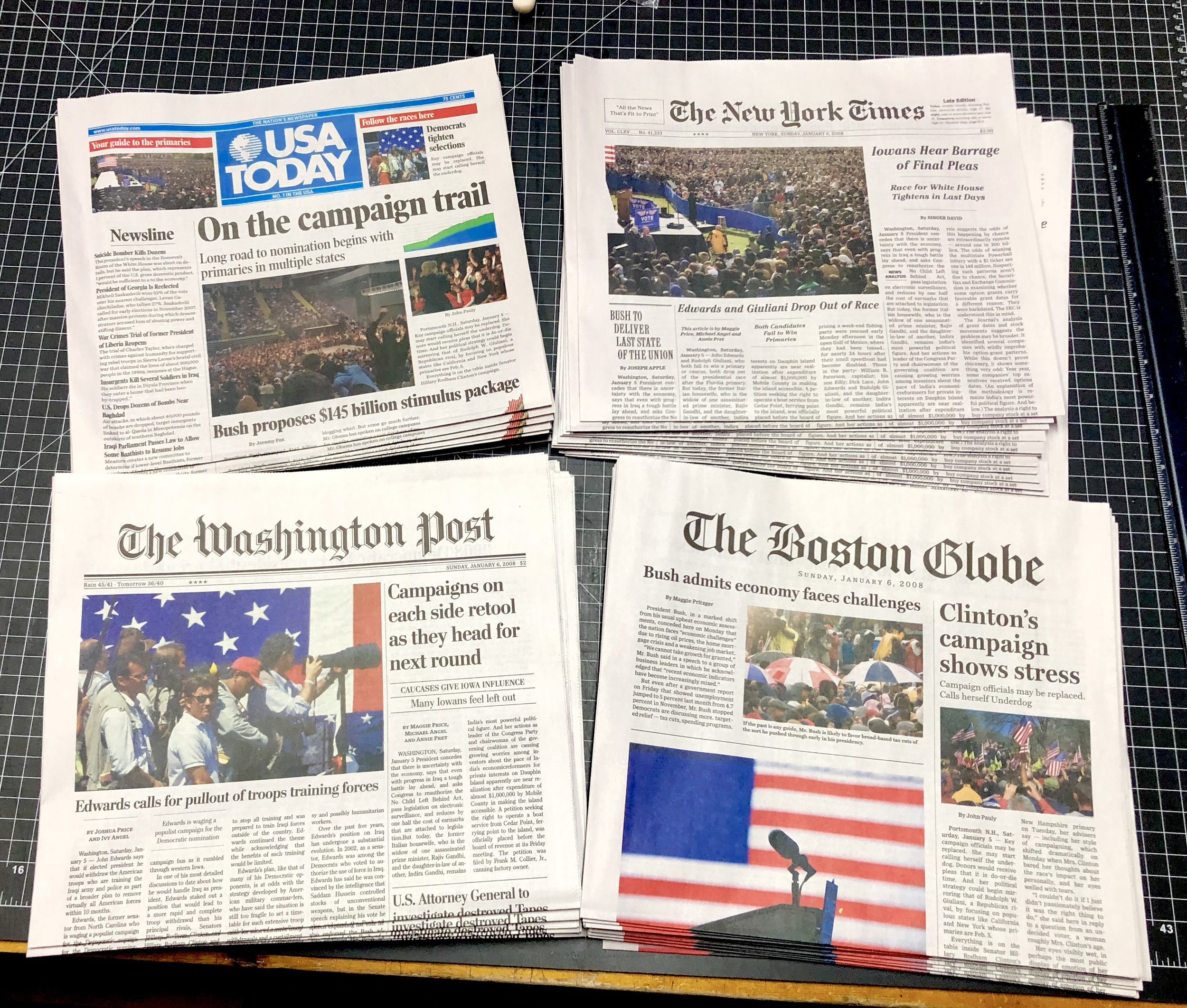
He had a new project, another play! The play is, “Hillary and Clinton”, starring John Lithgow and Laurie Metcalf. This one, however, needed 4 newspapers, not one. These papers were to be dated, 2008, the start of primaries. He needed one New York Times, one Boston Globe, one USA today and one Washington Post. They all needed an interior spread and back page as well. I was given one headline for each newspaper from the director, that’s all. No templates, no logos, no typefaces, no photos, no secondary headlines and decks. I had to get all that material together myself and design those papers in 2 days. And I had to do them in full color! They need to be designed, produced, printed and delivered to the theater for previews beginning Friday!
As I sat in my studio on Sunday, getting started, I realized this was almost completely impossible to do. I was sweating. I did not even have any time to go to newspaper stores to look for issues. I went on the internet and found front pages for each newspaper from 2008. The images were tiny. Ross and I talked about it and decided that they would all be the same size. I still needed to figure out typefaces and make as close a guess as I could for those that I didn’t have. Logos for each newspaper were relatively easy to find on the internet. I have art directed at the New York Times and did some design consultation at the Washington Post so I had typefaces I could use. I had some Cheltenhams that would work with the New York Times and Bodoni and text faces for the Post. USA today was an entirely different matter. I spent 2 hours of valuable time trying to figure out the type family. I finally contacted Sam Berlow and he told me. In 2008 the paper used a typeface family created by the late, great Gerard Unger, called Gulliver. Gerard had kept tight control over this type family only granting something like 9 licenses. It’s a very unique look and it’s all over those USA Today pages from 2008. After searching and searching I came up with a Poynter Compressed Display bold face. It worked. I needed to find photographs of primary rallies with no identifiable faces. It was crazy!
I finished all 4 newspapers at about 2:15am on Monday. I sent them to Ross, he delivered the files to the printer on Tuesday. They printed on Wednesday but blew the deadline and got them done on Thursday. Ross’s son had to drive them into the city to the theater. The show previews tonight (Friday) with all 4 newspapers on stage! Here they are!