
truecrime is a gangster novel by Jake Arnott, a British author, published in NYC by Soho Press. Soho had purchased the rights to three of Jake's books and I was slated to design the jackets for all of them, a magnificent project. I liked Jake's work a lot. Apparently David Bowie also did because he wrote a blurb for the jacket. I had an idea to use a Robert Longo drawing from his, Men in the City, series, but when I called his gallery and told them my budget they practically hung up on me. So I asked my friend, the great illustrator, Steven Salerno to dress up in classic gangster garb and pose for dead gangster images. We both went up to the roof of my studio on the coldest day that winter, 15ºF, and played dead. Every single picture was a winner, over a hundred of them. Something about the morbid nature of the subject matter must have appealed to us. The final jacket was warmly received by Soho's brilliant publisher, Juris Jurjevics. Typeface family was Dax by Hans Reichl.

Desirada, novel, published by Soho Press. Illustration by the great, Vivienne Flesher. Typeface is Cancellaresca script.

I got a call at my studio from Juris Jurjevics, the publisher of Soho Press. I had been doing jackets for Juris for several years at that point. He said, I have a book here, and I'd like you to design the jacket but it's a rather difficult book and if you don't want to do it for any reason whatsoever, I understand. I was intrigued. I told him to send me the manuscript. I started to read it and could not get through it. It was a political thriller called, "Senseless". The protagonist in the book is kidnapped, then his senses are removed one at a time, all while being posted on the internet from an unknown location, for all to see. It was too rough for me but I did have an idea. To me, when you lose a sense it becomes dull or out of focus or soft. I used a typeface called Ritual by Neville Brody for Fuse fonts. I enlarged it and made it very blurry, like a shadow with the smaller, sharper type in the middle. I also asked if we could not have any reviews on the back of the book. I made the URL blurry too on the back and enlarged it. I sent it to Juris and he sent it to the author, who loved it. Juris told me the author wanted to speak with me. I was a little freaked out about talking to him so I said it wasn't necessary. I few days later I got a call from Stona Fitch, the author. I kind of froze for a second and held out the phone while making a shocked face, like they do in stock photos. Turned out he was a lovely guy and told me that the merits of his book would be debated for years but no one will ever hate the cover design.

All Saints, a novel by Karen Palmer. Published by Soho Press. This book was my first design project with Soho Press. I worked with Juris Jurjevics and Laura Hruska. Karen is one of my favorite Soho authors. This impressive volume weaves the tales of 3 individuals whose lives diverge in 1950s Louisiana. Harlan Dessonier, Glory Wiltz and Father Frank Doyle are characters that are as unique as their names. I created an intricate digital, gold grillwork that spanned both flaps, back cover, spine and front cover. The individual panels are connected by thin gold rules, the front cover framing a photograph by Josef Sudek of a grave in the Malá Strana Cemetery in Prague. The typeface with those beautiful details is Engravers Classic by Dennis Ortiz-Lopez.

After, a novel by Phyllis Reynolds Naylor, published by Soho Press. This was a tricky jacket to do. The photograph of a bird in flight by Rosalie Winard, was a given. I had to use it. It was a black and white image. I immediately set about to colorize it with some red quadtone imaging. It looked good. I then could really only contribute an appealing typographic treatment. I turned to the inimitable Dennis Ortiz-lopez for some type recommendations. He had a rather unusual italic rendition of the Egmont typeface. That "f" is not typically what it would look like (for verification of my claim, please consult with either Tobias Frere-Jones or Jonathan Hoefler) I think they would stand by me (Oh God what have I gotten myself into?!) The client and the author liked the jacket. Mission accomplished!

Stone Cowboy by Mark Jacobs. Published by Soho Press. This was my second jacket commissioned by Laura Hruska and Juris Jurjevics at Soho, the day after my first assignment. An American magician vanishes in Bolivia while searching for the true magic which he feels exists in the altiplano and mythic Indian cultures of the country. His sister travels there to find him and enlists the help of another American who speaks Spanish and the Aymara Indian dialect. Photograph by the Guatemalan photographer Luis González Palma.
One of the editors at Soho had seen an exhibition of this photographer’s work in California and asked me to take a look at it. There was certainly the haunting, magic realism of the region in his images. And that color, with white accents. We chose this image then I created the semicircular title levitating over the image. Typeface is Bodega Sans.

The Devil's Cup, by Stewart Lee Allen. Published by Soho Press. A wonderful book on the history of coffee. Stewart traveled the world looking for the origins of this tasty bean and came up with this glorious story, in a sort of a gonzo style. The title art just came to me and got a little help from hours of photoshop work.
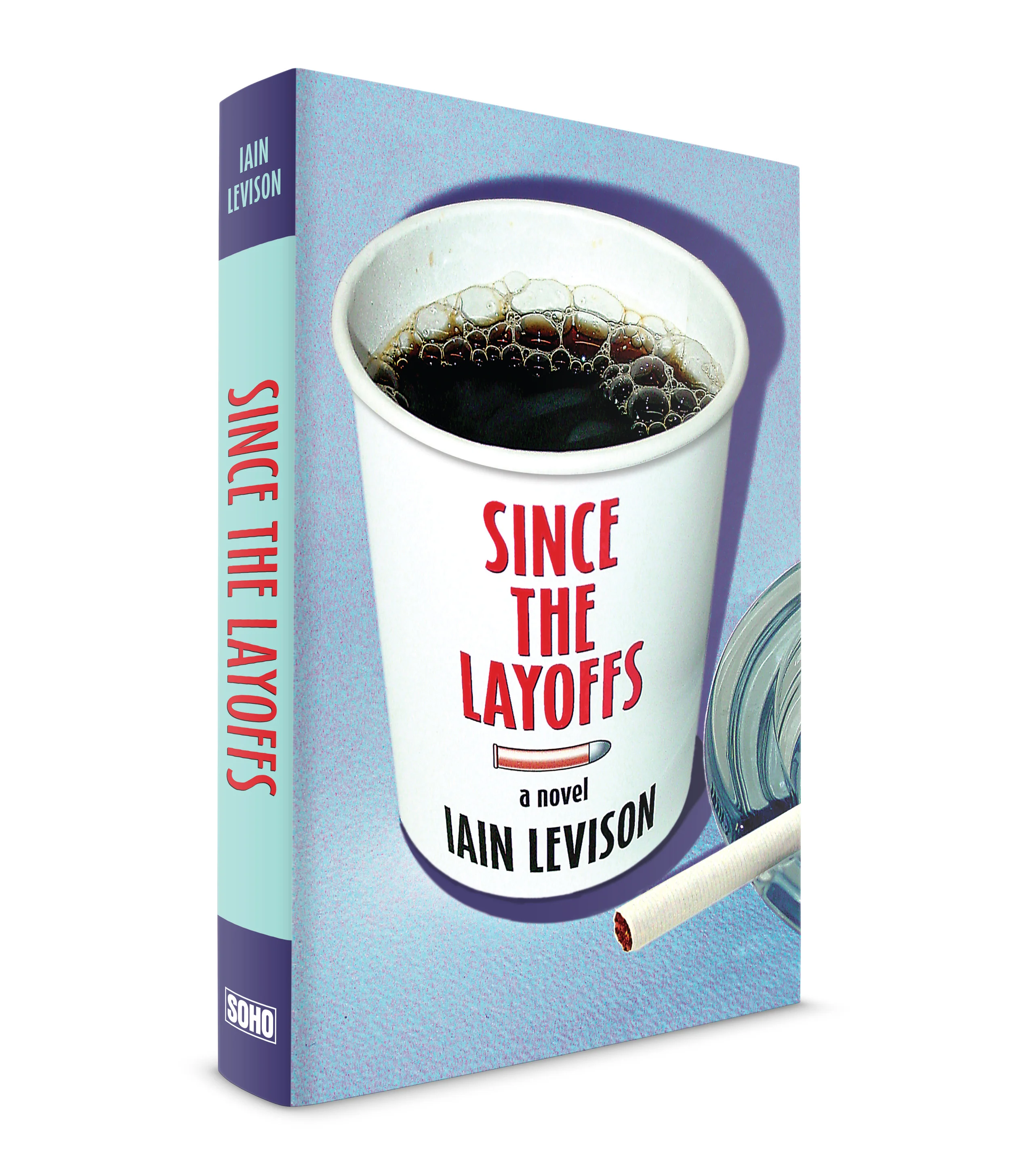
Since the Layoffs, by Iain Levison, published by Soho Press. Jake, the protagonist in this black comedy works in a factory that makes tractor parts in the midwest. Everyone in the town works there. When the factory shuts down, they all become unemployed. Jake is doing a little work at a convenience store when he is hired to committ a particularly gruesome crime. He does it and does it well and gets paid for it. Then he's hired to committ another crime. Now he's the only person in the town who is gainfully employed. I made the coffee cup label and photographed it, then did the imaging. People in the town go to the Gas 'n' Go for coffee while they try to figure out what's next for them.

The Long Firm, a novel by Jake Arnott. Published by Soho Press. This was the first jacket of three that I designed for Jake's books. All three capture the seedy gangster lifestyle of London in the 1960s, including their interest in show business society. Harry Starks is the protagonist, a ruthless contemporary of the infamous Kray brothers. Evil, menacing yet a romantic. I always pictured Harry in shadow. Dark and imposing, and always with his boys close by. An excellent novel told in multiple voices. The book was so popular the BBC made a TV movie of it. A 4-part series I haven't seen but would love to.
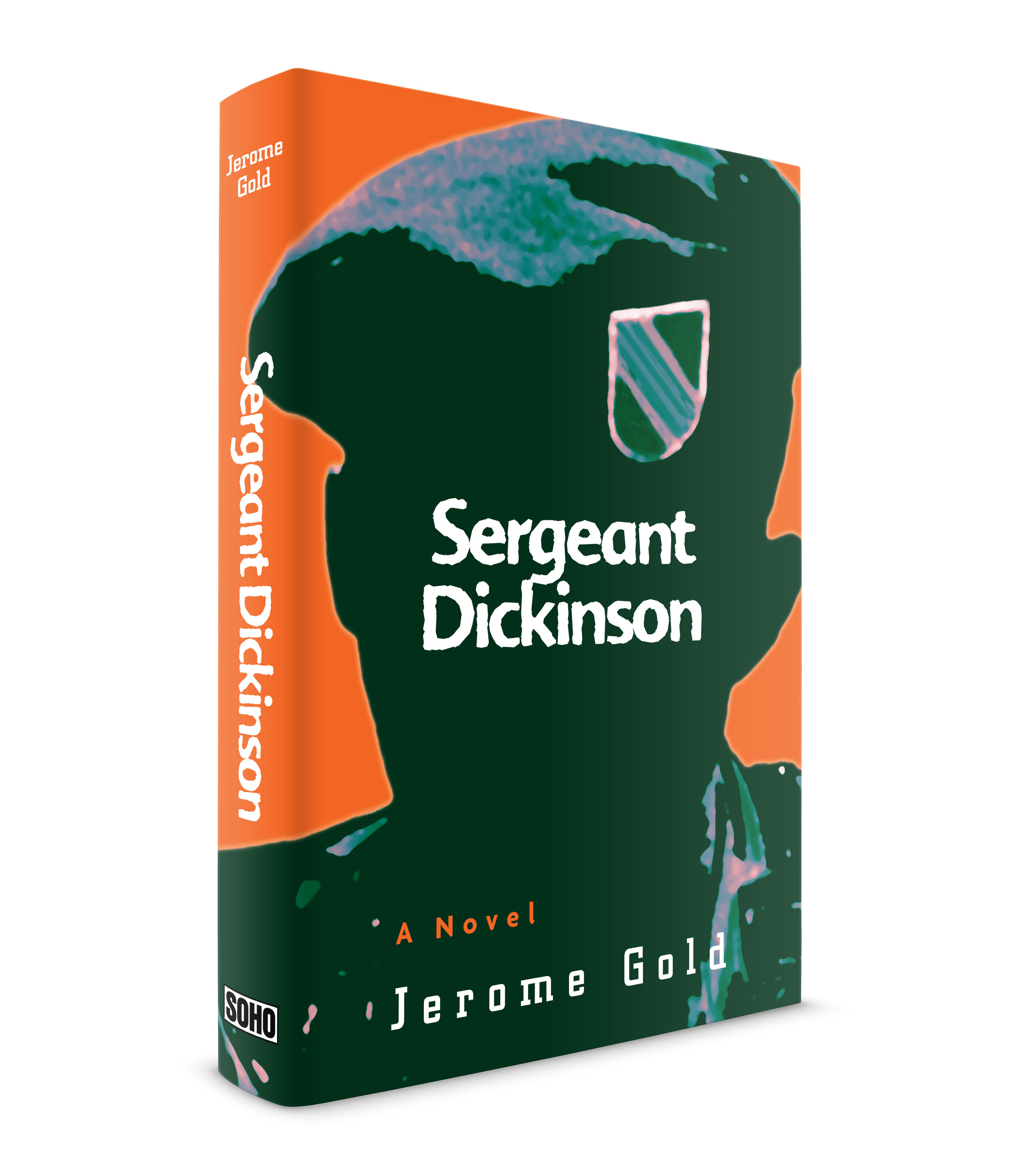
Sergeant Dickinson, by Jerome Gold, published by Soho Press. This was my first Vietnam novel. I was very busy at the time but I remember thinking, this is an historic period and I must pay close attention to the story and put my best effort forward. Jerry Gold (the author) was a special forces officer in Vietnam who survived a particularly deadly attack in the early stages of the conflict. His novel spared no details in the gruesome and often, graphic depiction of war. He told the story with poetic grace. Juris Jurjevics, the publisher, and Jerry wanted to try something that made use of the special forces patch that the officers wore at the time. I tried it but it looked like a boy scout patch (I have another idea now that might work). I did my own research and found an image in my Dad's collection of National Geographic magazines (he had the entire collection from 1896 minus a few issues) of a special forces officer from the exact month and year that the story takes place. It was a tiny photo of an officer in a jeep. I enlarged the photo 1000% and performed some photoshop imaging. I blacked out the soldier's face, like they do on TV when an interviewed person has a particularly difficult story to tell. I then used a distressed typeface called, Advert Rough (FontFont) and placed the title right on the center of the darkened area. Juris and Jerry the author agreed on the layout. Jerry said he had not seen that badge on the beret in almost 40 years. When the author likes the cover, you know you did well.

Play Money, by Phillip Allen, published by Soho Press. This story takes place during the heyday of Wall Street when young entrepreneurs took extraordinary chances, gambling other people's big money to make bigger money. It was a fast paced book so I found some images of hustling downtown lawyers. I could not find an image of the New York Stock exchange that worked so I ran downtown and photographed it myself along with the surrounding buildings. There were a lot of layers in this piece. I created a transparent, library-lamp green, digital belly-band with the book title and author's name on top of it. I tried to make the background buildings the color and texture of money. The typeface family was Electra, created by WA Dwiggins.

Deceit, Betrayal, A Dark Devotion. Novels by British author Clare Francis. Published by Soho Press. Occasionally I will be asked to design a series of books by one author. This trio of murder and mayhem thrillers was a fun series to complete. Having formerly been a yachtswoman and single-handedly sailing across the Atlantic Ocean, this author's books tend to have ships, boats and watery deaths in them. I made a template for the books using a distinct slab typeface called Schindler and created high-hued quadtones for the images, giving each a unique color palette.

How Evan Broke His Head and other Secrets, by Garth Stein, Published by Soho Press. The novel is about a rock guitarist who unknowingly fathered a child 14 years earlier. The boy's mother dies and the father is reunitied with his son. His son is not happy. A very good book by Stein but a very difficult cover to do. The title was long and we tried some rock 'n' roll imagery but it was not working. We experimented with a lot of directions. I decided to try a father/son photo and did some imaging to bring the characters to life. I like this one a lot. Despite the hard work I enjoyed working together with Juris Jurjevics, the publisher, as well as the young editor at Soho Press named Bryan Devendorf who went on to find fame as the drummer for the great rock band, The National.
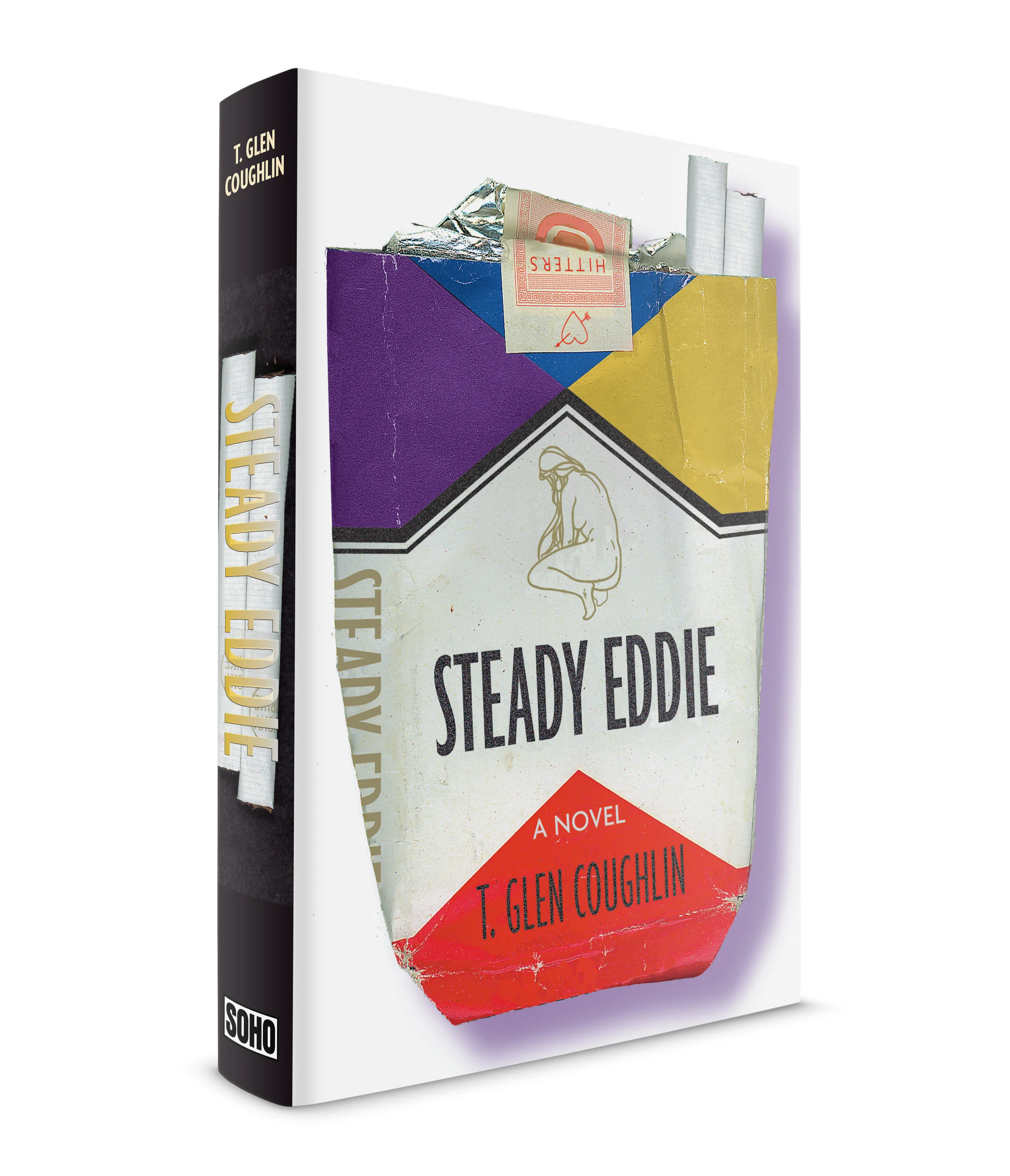
As any Book Designer knows, most jacket layouts get rejected. This was a rejected cover for, Steady Eddie, by T. Glen Coughlin, published by Soho Press. A couple of tough guys growing up on Long Island, one has an uncle in the mob, the other's father takes photos for a skin magazine. Townies these boys are known as, or hitters. Everyone at Soho liked this one but they went with another cover that had, perhaps, a wider appeal.

Bright Starry Banner, a novel by Alden R. Carter. Published by Soho Press. This is a Civil War novel where the author has created a fictional account of the pivotal Battle of Stones River. This was a 3-day battle that was, perhaps the bloodiest ever fought on U.S. soil. I guess my biggest challenge here was to make a jacket for a Civil War novel that didn't look like an old book. I used a painting by, John Paul Strain that depicted the actual battle described in the book. I used a beautiful slab serif text face called, Caecilia. The sans-serif is, Agenda and I'm not completely sure of the slab serif in the title. I think it's Egyptienne. For me, the wavy flag banner helps to give it a contemporary look.

The Liberation of Little Heaven and other stories, fiction by Mark Jacobs. Published by Soho Press. The second book of Mark Jacobs' work I had the pleasure of designing. From the jacket text, "This book explores the spiritual territory of South America, whose Latin and Indian culture seems haunted by its shaky future ... "People are inundated by the press of their Western ambitions and the gravity of their traditional beliefs."
I worked again with the photographs of Luis Gonzalez Palma for this jacket, just as I did for "Stone Cowboy" by Jacobs. Haunting and mysterious imagery, like the ghosts of former Bolivian enemies that Jacobs writes about in one story. The title was very long so I placed it on its side. It worked very well with the vertical image that would not have worked with a title running through it. I made little stars to compliment the stars in the young woman's crown and dispersed them into the darkness of the cover, spine and back cover.

He Kills Coppers, a novel by Jake Arnott. Published by Soho Press. This was the second of three books by Jake that I designed the jacket for. It's a look into the sordid gangland life of London in the 1960s. One character is a tabloid journalist that I pictured behind his old Olivetti typewriter banging out story after story, hence my use of the Trixie typeface. There is another character in the book who carries around an old, small newspaper photograph of someone he's been looking for for years. The photo is faded from being folded. The person he's looking for is described as someone who is easy to describe but difficult to identify. I think this was one of the photos I researched of men at that time period. The image is soft focus and the eyes are covered, making identification difficult. The background of the flaps, spine and back cover was crumpled paper, like the kind you see on TV, that old-time journalists would rip out of the typewriter and throw in a small waste basket. I started the text of the novel on the cover to give the impression that you were watching the journalist as he typed the story.

Border Dogs. A novel by Karen Palmer. Published by Soho Press. This is the second book by Karen Palmer that I was brought in to design the jacket for. Another wonderful novel. The protagonist is a border patrol officer in the south east California desert who works on horseback (quieter than jeeps) searching for illegals crossing over. He was adopted as a child and has high cheekbones for a white man. Word comes to him on the death of his birth mother and what he finds out puts him in the position of having two allegiances.
I decided to not go symbolic on the cover but wanted to explore the actual scenes of arrests on the border and images of people crossing if I could find them. I managed to locate a photographer (Jeffrey Scott) for a small newspaper in Nevada I think it was. He had accompanied officers on crossing arrests. He was surprised when I called him. "You want pictures for what??" He sent me hundreds of photos of actual border captures as well as infrared images (border patrol use these at night) of illegals crossing at night. These photos captured, if I remember correctly, certain scenes in the book very accurately.